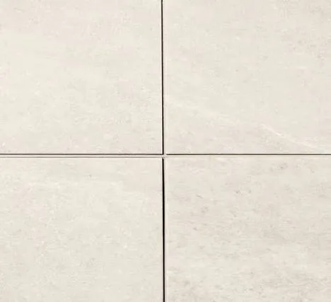
A convincing tile-look floor depends on more than the stone pattern. The line between the tiles helps define the scale, rhythm and character of the whole surface.
That detail is the focus of i4F CeraGrout: an integrated grout effect that brings a recognisable ceramic-tile appearance to rigid-core flooring. For a distributor building a stone-look SPC collection, it creates another design decision worth making carefully: how the surface and the joint work together.
How CeraGrout works
In the rigid-core construction described by i4F, a coloured layer sits between the decorative film and the core. The grout lines are milled into that layer, making their colour part of the product construction.
The result is a visible joint effect formed into the panel. The installer does not create that effect by filling each joint with conventional grout after laying the floor. i4F also describes an optional centre line that can make one panel appear as two tiles. Whether that feature is included depends on the selected product. See i4F's CeraGrout technology overview.
For the buyer, the useful next step is to see several pieces assembled. A single tile shows the decor; a larger arrangement shows what the grout line does to the floor.
The grout colour changes the design
Imagine the same pale stone decor with two different joints. A close tonal match can make the floor feel quieter and more continuous. A stronger contrast makes each tile more distinct and gives the layout a more graphic character.
Neither direction is automatically better. The choice depends on the collection, the room and the customer it is intended to reach.
When reviewing a combination, look at:
- the relationship between the grout colour and the lightest and darkest parts of the decor;
- the apparent width of the joint when panels are assembled;
- how the surface texture and gloss look beside the grout detail;
- and whether the pattern still feels balanced across several tiles.
Choose the decor and grout together, then keep the approved combination as a physical reference.
Explore the colour references
The Westlake colour reference photographs supplied here provide a starting point for discussing the grout direction. Open an individual reference to see the original sample photograph:
- Light and neutral directions: X01873P, X04600P, X51773P, X72182P and X74152P.
- Blue-toned directions: X51774P and X54121P.
These are colour reference materials, not photographs of finished installed floors. Lighting and screens affect their appearance, so the final choice should be made against a physical sample in the intended flooring construction. Available decor and grout combinations can be confirmed with Euro Vietnam.
Practical benefits, checked against the finished product
i4F presents easier cleaning and resistance to wear, stains and household chemicals as benefits of CeraGrout. Those are the technology provider's claims; performance specifications for a collection should come from the manufacturer of the finished product. Read the i4F product leaflet.
For a new range, ask to review the actual panel format, total thickness, wear layer, locking system, care instructions and intended applications alongside the design.
An integrated grout feature does not settle every installation question. Suitability for bathrooms, walls or other specific settings should be confirmed for the selected product and its installation method.